OWL & BEAR BRANDING
Spring 2021 | Student Work | Illustrator, InDesign
Unfortunately, kids don’t get to choose what they wear—their parents do.
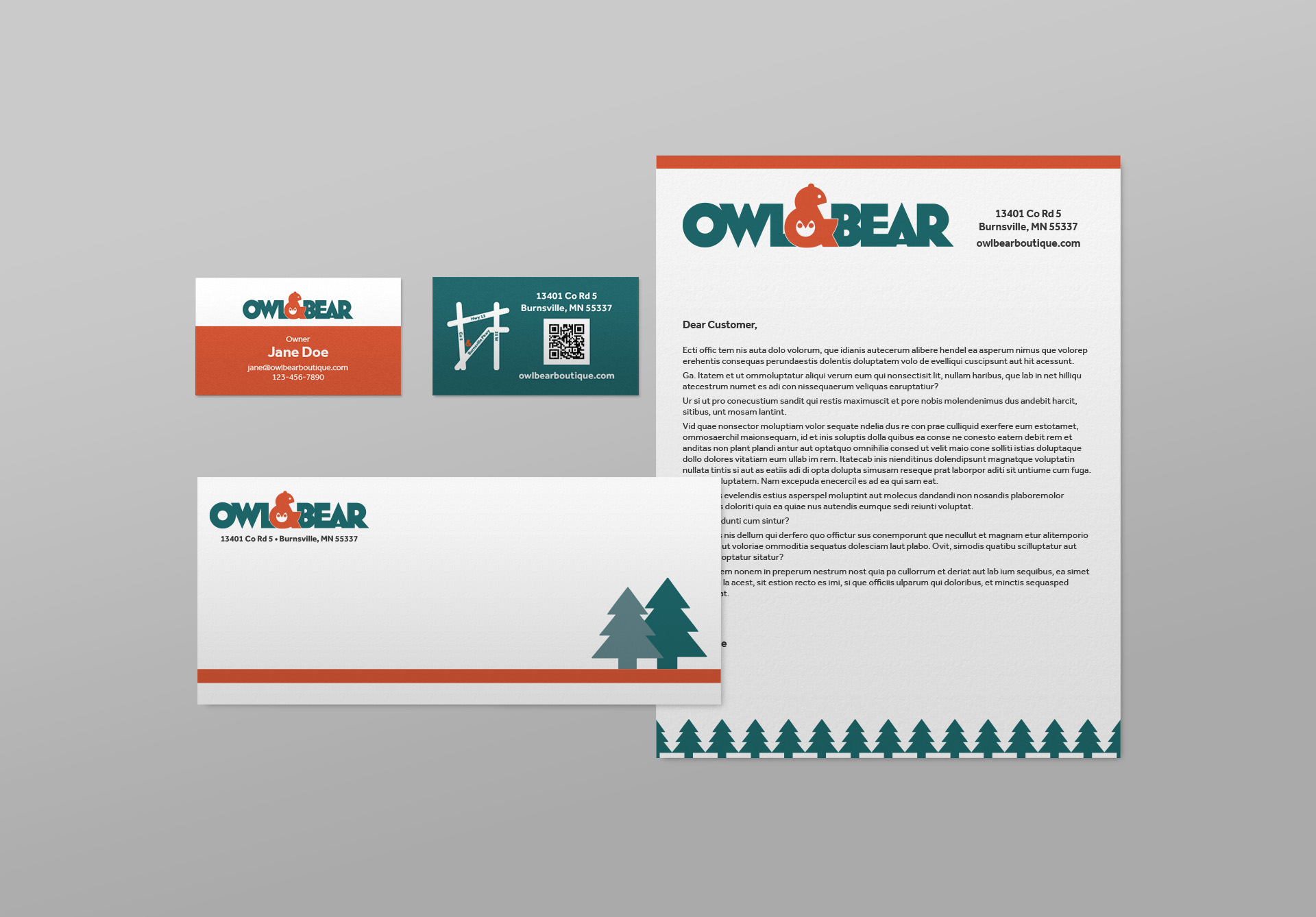
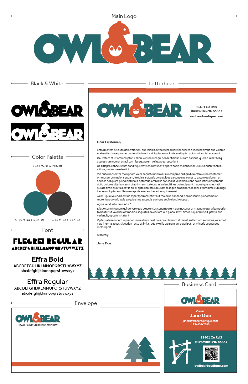
For Owl & Bear, an up-and-coming children’s boutique, their logo needed to express their quality products with organic and gender-neutral options. Although the kids don’t have the final say, they are amazing at recognizing logos of their favorite brands, so they were also absolutely an important part of this project.
Dark teal and burnt orange represent nature (organic, and where owls and bears live) which are also gender-neutral colors. Burnt orange represents active kids while dark teal represents parents watching over the kids. An owl and bear are incorporated into the ampersand—like a bear holding an owl—to show lots of love.
This logo not only tells the brand’s value but also gives an uplifting feeling to both the parents and kids.


