MOTOKAZIE BRANDING
Fall 2021 | Student Work | Illustrator, InDesign
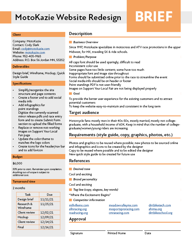
Motokazie, a race promotion company, wanted to have their website redesigned as it was not offering the best user experience. But the root cause was the lack of consistent branding: overused all caps font and inconsistent color use made the users confused.
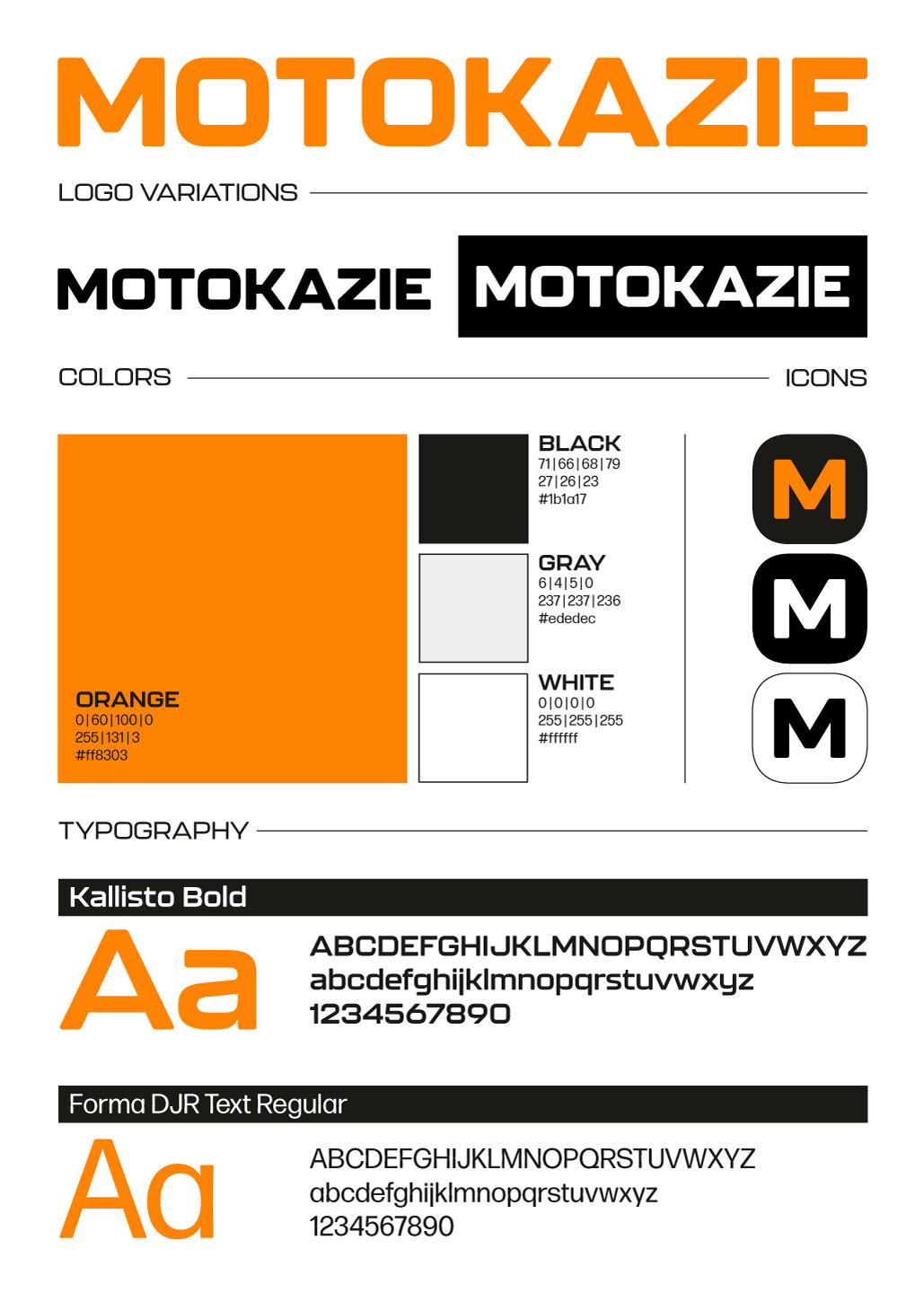
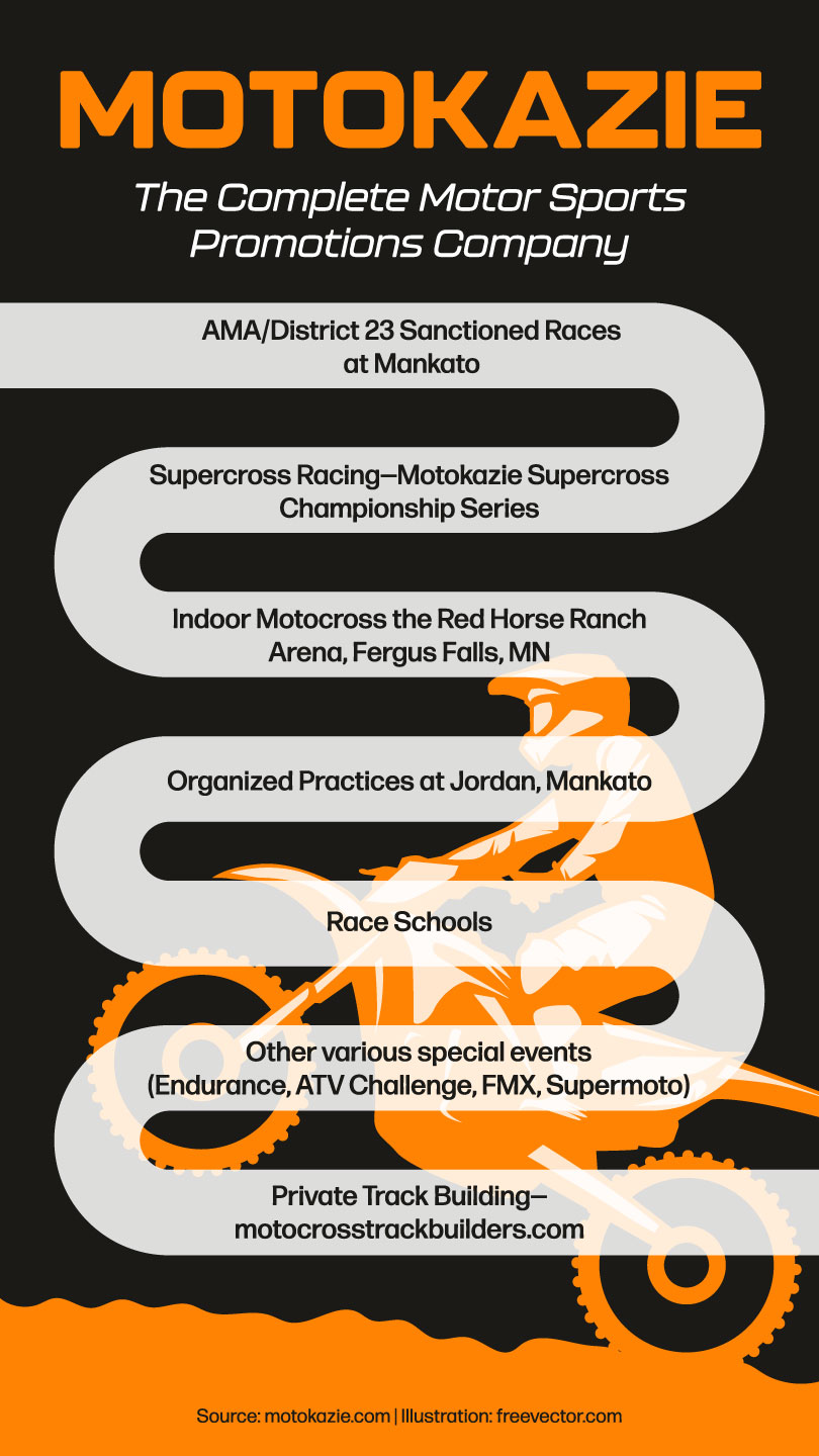
A Creative Brief was created as a fundamental base to address the issues and goals. The new logo and the typeface express their sporty and cool moto races. Orange shows the enthusiasm while black shows the strength. An infographic helps viewers understand immediately what Motokazie does thanks to the new branding and motocross themed layout.


