T&T BRANDING
Summer 2021 | T&T Logistics LLC | Illustrator
Ambitious start-up needing an awesome logo?
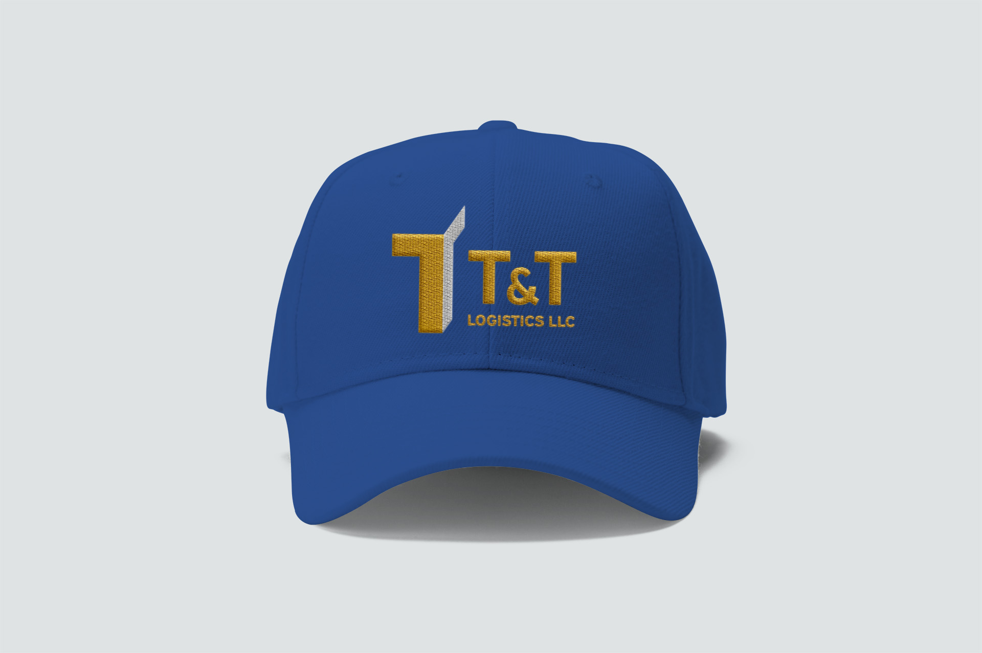
T&T Logistics has a great vision to focus on their drivers. Their logo needed to represent that, and also needed to look great on their truck.
By manipulating straight and angled lines, ‘T’ is standing solid and energetic at the same time. Blue emphasizes their expertise in the industry while yellow shows their freshness and positivity. The typeface shows professionalism, friendliness, and high legibility from a distance.
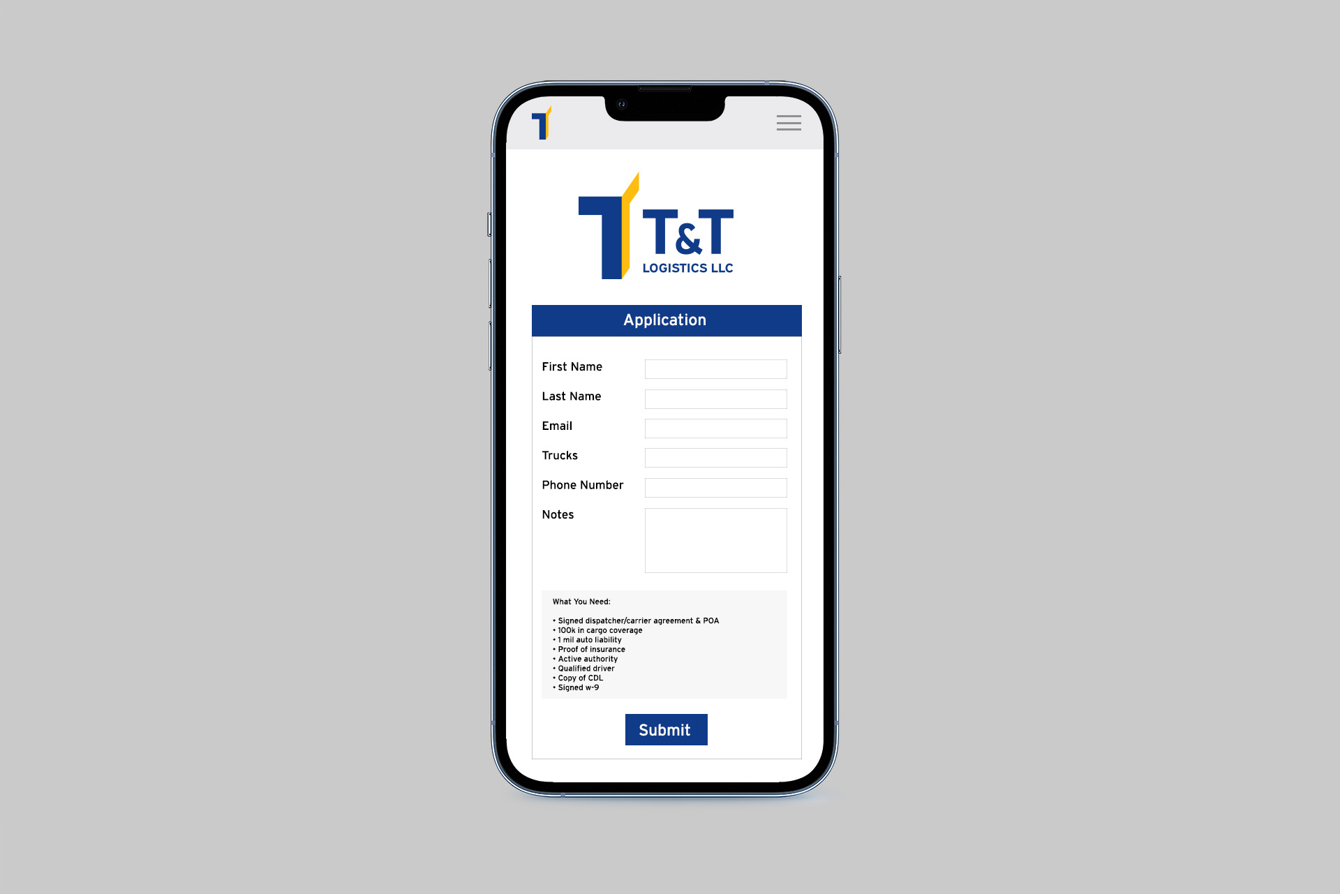
The logo’s simplicity lends its flexibility: from the tiny one on their company application to the large one on their trucks on the road.


