TOURISM BRANDING
Spring 2022 | Student Work | Illustrator, PowerPoint
Hakone, a Japanese popular weekend trip destination near Tokyo, needed to rebrand. Their old logo was too bold for this family-friendly destination and was not recognized by most people. My goal was to make the new logo very friendly with a softer color scheme to atttract people from all ages (yes, it's a great place for families, couples, friends and a solo-trip!) both nationally and internationally.
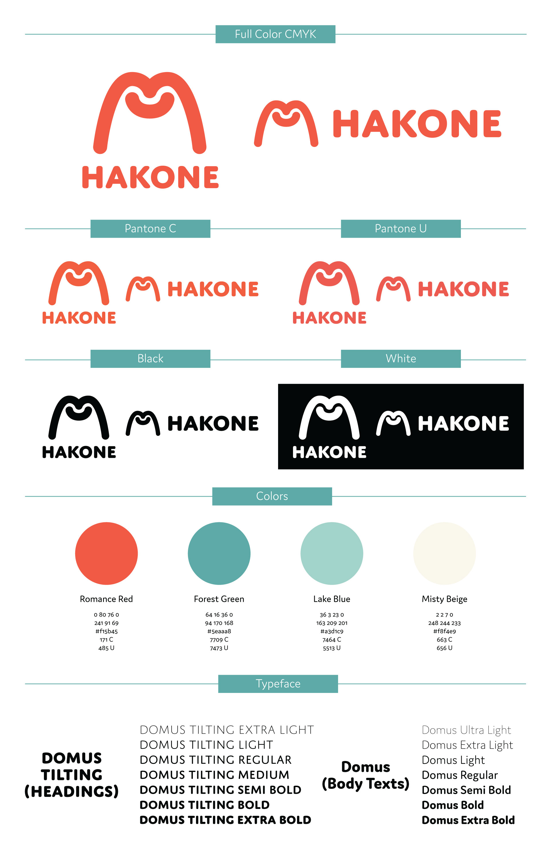
The new logo represents the unique characteristics that Hakone offers: mountains, hot spring and a smily face that the visitors will get. The rounded typeface gives an extra friendly feeling and the great legibility works well on the city signage as well.
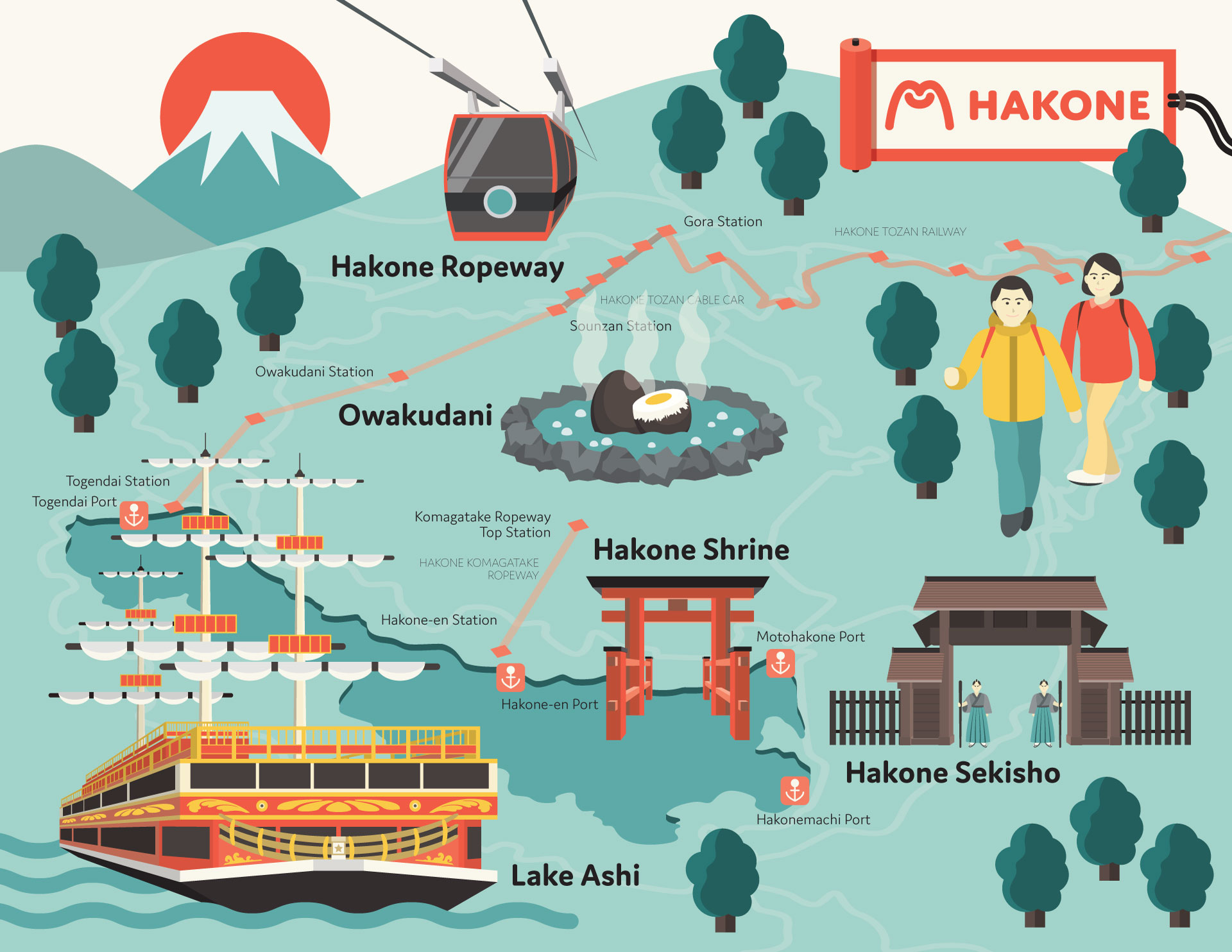
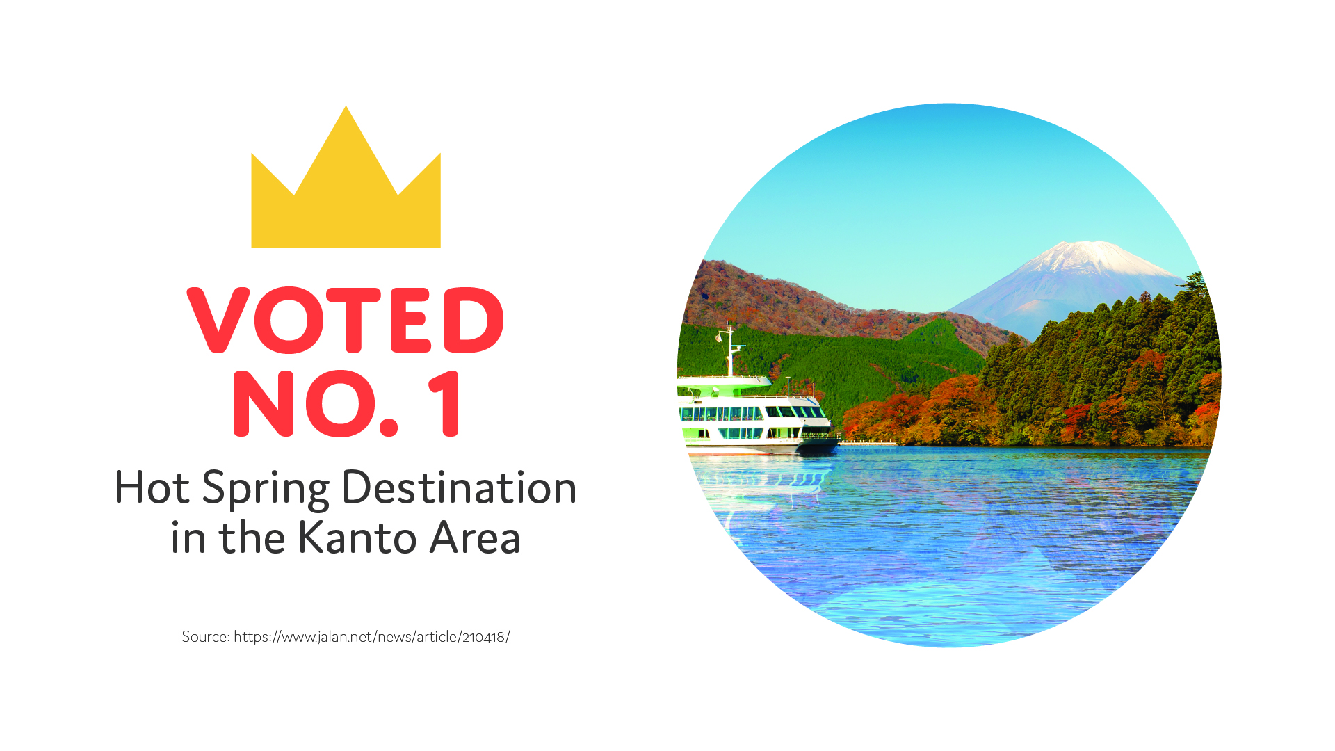
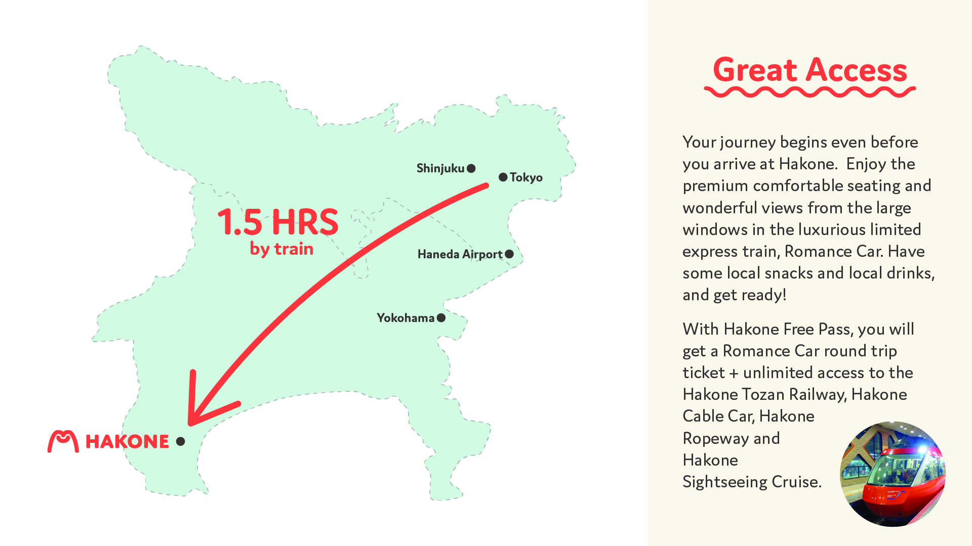
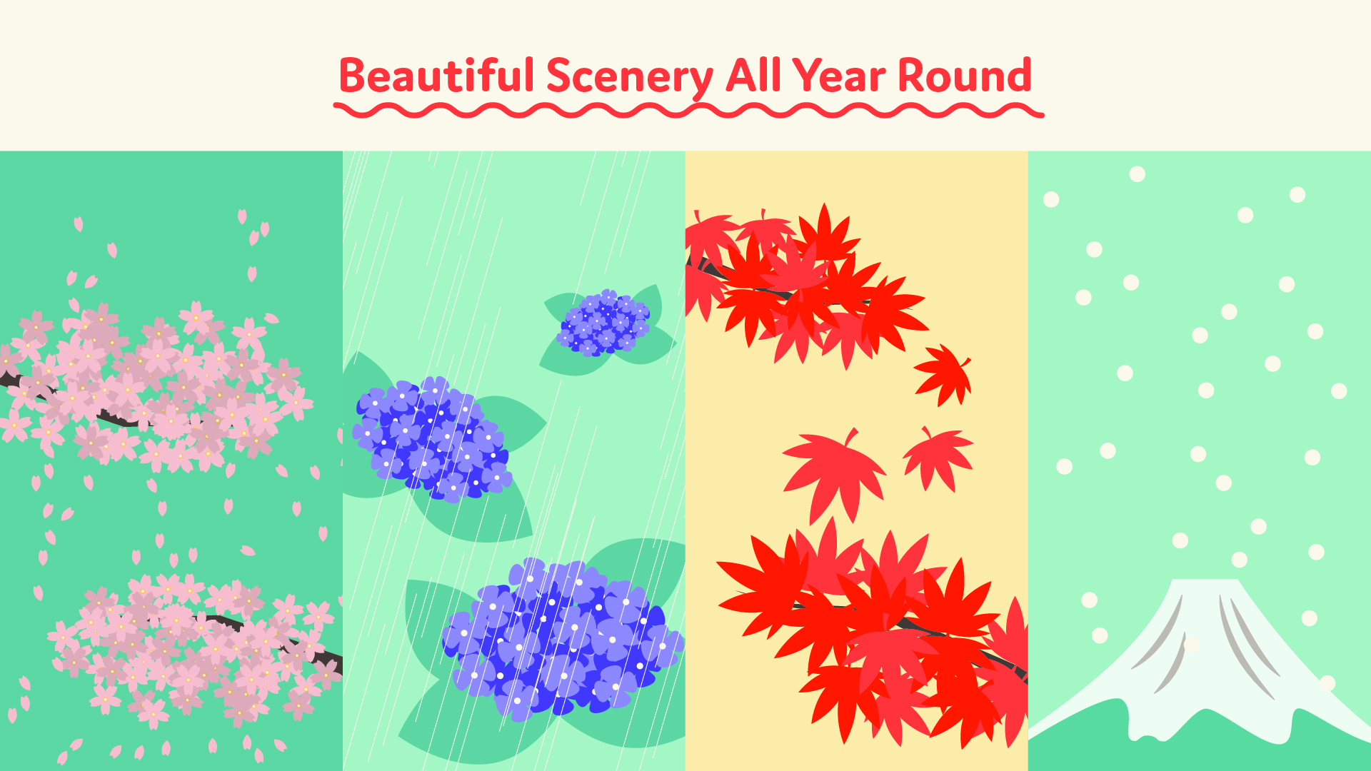
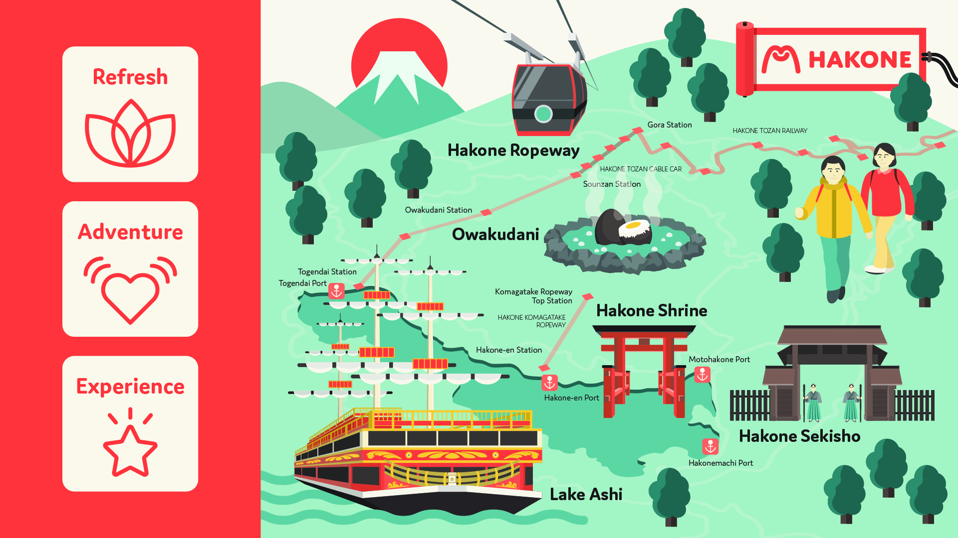
Along with the new brand guidelines, I created an illustrated map and a pitch deck for them.
